
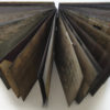
Katherine Krcmarik
The Distance Between
screenprint
26 x 20 in.
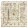
This body of work is greatly informed by the relationship between type and image. As a designer, typography dominates my work. I have also long used writing as a way to express the things I couldn’t say verbally. It seemed only logical that my prints would include both words and image. The words reveal what the image cannot. All my thoughts and pain is contained in the words of each print. In each case, I wrote at least a portion of the words in the moment I was feeling the intense emotion associated with the piece. The words became the starting point for the print. The words drove the creation of the image and the image lead to refining the words.
The overall goal with the creation was to produce a print that was both beautiful and ugly at the same time, much as I felt about the situation I found myself in. From a distance, you just see this almost idyllic image constructed from gold and silver ink. It represents my attempt to put a positive spin on my experiences, much as our brains tend to paint the past in the best possible light tricking us into forgetting the bad parts. However, when you get close enough to read the words, my true feelings about the situation are revealed. The words are all the things I needed so desperately to say to the person at the moment I wrote them. They show the pain I was feeling but could not express. A viewer can choose to only see the image and not delve further into the emotion remaining pleasantly oblivious to the pain or the viewer can read the words and experience the full weight of the piece. Overall, the work allowed me to work towards healing from these very painful moments in my life.
© Katherine Krcmarik